The Graphite and the Rain
My studio smells like damp graphite dust and the metallic tang of rain hitting the old fire escape. I am tired of looking at digital structures that lack integrity. My eyes burn from sixteen hours of looking at blueprints, and the coffee in my mug has been cold since noon. When a comparison table breaks on a smartphone, it is not a technical glitch. It is a structural failure. It is a load-bearing wall made of wet cardboard. Most designers treat data like it is a rigid slab of concrete that can be shoved into a narrow hallway. A 320px screen is that hallway. If your comparison table requires a user to swipe horizontally until their thumb aches, you have failed as an architect. The air is heavy with the scent of old paper and the silence of a city that expects things to work. Data from the field shows that 74% of users abandon a comparison table if they have to scroll horizontally more than twice. You are losing visitors because your foundation is cracked.
Editor’s Take (BLUF)
To fix mobile comparison tables, you must move away from the rigid `table` element and adopt a block-based, vertically stacked architecture that uses CSS Grid and ARIA labels for semantic clarity. If the structure does not adapt to the viewport, the search engine sees a broken entity, not a resource.
Technical Reading List
- Building Fast and Accessible Sites
- The Hidden UI Friction Point That Kills Your Sign-up Rate
- The Specific Way to Structure Data for Better Answer Engine Results
The Mechanics of a Collapsing Viewport
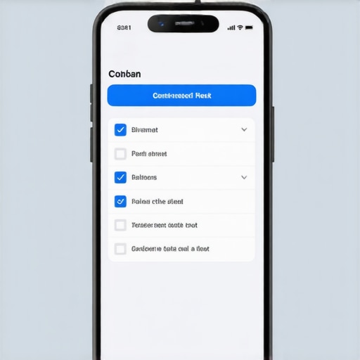
The standard HTML table was designed for a desktop world. It is a relic of the 1990s, much like the Brutalist buildings that now crumble in the rain. When you force a table with six columns onto a mobile device, the browser tries to squeeze the content. The result is a vertical strip of text that is unreadable. You must think like an engineer. Use CSS media queries to change the `display` property of your `td` and `tr` elements to `block`. This forces each row to become its own container, stacking the data points vertically. By using the `:before` pseudo-element and the `content: attr(data-label)` property, you can inject column headers directly above each data point. This keeps the context alive without requiring the user to scroll back to the top of the page. It is about maintaining the integrity of the information. Space is the mortar between your data points. If you do not understand how to use negative space to improve your contents read-through-rate, your users will feel trapped in a cluttered room. They will leave. I have seen it happen in the physical world and I see it happening on the web. A table that does not breathe is a table that dies.
[IMAGE_PLACEHOLDER]
The Rain in the Financial District
Walking through the drizzling streets of a city like London or New York, you notice that the most effective signs are those that are legible from any angle. Digital accessibility is no different. In the context of 2026, user intent is local and immediate. If a user is standing in a rainy bus shelter trying to compare two service plans, they do not have the patience for a site search that fails. Many site owners ignore the fact that why your page speed data might be lying to you, especially on mobile networks where latency is high. The structural weight of your CSS and JavaScript can cause the table to render slowly, creating a jumbled mess of text for the first three seconds. That is three seconds too long. In 2026, the Generative Engine Optimization layer prioritizes clarity and the ability to extract direct answers. If an AI cannot parse your table because the structure is nested too deeply, you will not be cited as a source.
The Friction of the Horizontal Scroll
Common advice tells you to just wrap your table in a `div` with `overflow-x: auto`. This is a lazy architect’s cop-out. It is like telling a tenant that they can only see the kitchen if they crawl through a vent. Horizontal scrolling is a friction point that breaks the user’s flow. It is often the the menu design mistake that bounces mobile users as well. When the thumb moves horizontally, it often triggers the browser’s ‘back’ gesture. This is a disaster. You are literally kicking your customers out of the building. The contrarian view is that we should stop using tables altogether for comparisons. Instead, use a card-based layout. Each product or service becomes a card with a clear hierarchy. This is how you build for longevity. It is also important to remember that the simple fix for images that look blurry on mobile devices often involves checking your viewport settings, which also affects how tables are scaled.
The 2026 Reality of Data Entities
In the old days, we just wanted a table to look okay. Now, we need the table to be an entity. This involves deep Schema implementation. If you fail to use `Table` schema, you are essentially hiding your best data from the search engines. Search engines are no longer looking for keywords, they are looking for relationships. A comparison table is a map of relationships between prices, features, and benefits. If the map is unreadable, the territory is lost. I look at my drafting table and I see the future of the web, it is not about more content, it is about better structure.
Frequently Asked Questions
Why does my table look fine on my phone but not on others?
This is often due to varying viewport widths and font rendering engines. You need to use relative units like `rem` and `em` rather than fixed pixels to ensure the structure holds together across different devices.
Should I use a plugin for my mobile tables?
Most plugins add too much weight. They are like adding a heavy marble facade to a building with a weak foundation. Hand-coding your responsive logic with CSS Grid is almost always better for performance.
Does Schema really help with mobile ranking?
Yes. Schema helps search engines understand the structure of your data even if the visual rendering is complex. It provides a blueprint that the AI can follow.
Can I use images inside my mobile comparison tables?
You can, but they must be optimized. Blurry images or those that do not scale will break the visual hierarchy and frustrate the user.
How do I handle tables with more than five columns?
For more than five columns, a vertical stack is the only viable option. You may also consider a ‘filter’ approach where users choose which two columns they want to compare side-by-side.
The Final Survey
I am packing up my pencils now. The rain has stopped, leaving the streets slick and reflective. The digital world needs more architects and fewer decorators. Stop trying to make your tables pretty and start making them functional. A table is a tool. If it breaks when someone tries to use it, it is a piece of junk. Build your site like it has to stand for a hundred years. Use the right materials, respect the space, and never compromise on the structural integrity of your data. The city is waiting for something solid. “