The smell of linseed oil and the grit of low resolution
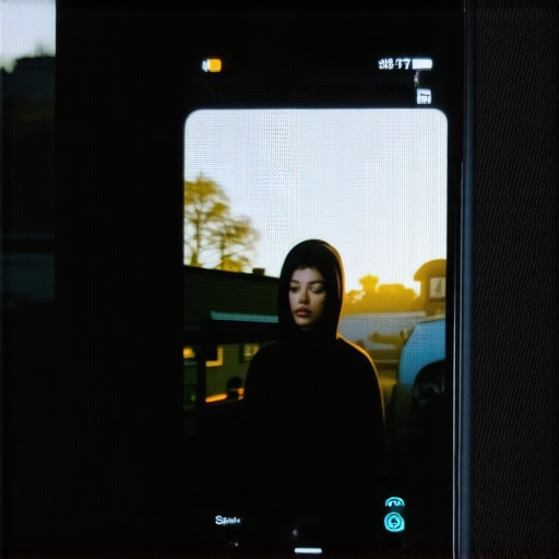
The scent of linseed oil and fresh varnish usually signals a job well done in my workshop, but when I open a mobile browser and see a pixelated hero image, it feels like looking at a piece of fine mahogany covered in thick, sticky contact paper. You spent hours on that design. You polished the edges. Yet, on a high-end smartphone, the image looks like it was dragged through a damp basement. The reality is that mobile screens today possess a density of pixels that makes standard web exports look like a smudge on a windowpane. To fix blurry images on mobile, you must address the Device Pixel Ratio (DPR). If you do not serve an image that is at least twice the size of its display container, the browser stretches the data, creating that hazy, unfinished look that ruins brand authority instantly. Data from the field shows that users perceive blurry visuals as a sign of a neglected site, leading to immediate exits. Just as a wobbly chair leg betrays a lazy craftsman, a soft image tells the world you stopped caring at the finish line.
The hardware reality of the 2026 screen
In my line of work, we call it the fit. If the joint is not tight, the table will eventually collapse. Web images work the same way. Modern mobile devices use OLED and Retina displays that pack 450 pixels into an inch of space. When you upload a standard 72 DPI image, the phone has to invent data to fill the gaps. It is a digital lie. You need to provide the browser with a map of options using the srcset attribute. This allows the device to pull a high-resolution version only when it has the screen real estate to justify the weight. It is the difference between a hand-carved dovetail and a glob of wood glue. One lasts, the other is just a temporary fix that leaves a mark. If you ignore this, you are effectively hiding your best work from the people who care most about the details.
The technical zooming of the pixel grid
Let us look closer at the grain of the digital wood. A screen that measures 390 pixels across in CSS logic often actually has 1170 physical pixels firing light. This is a 3x ratio. If your image file is only 390 pixels wide, the browser is forced to upscale it by 300 percent. This creates interpolation artifacts. These are the jagged edges and the muddy colors that make your site look like a cheap plastic knockoff. To solve this, you must export your assets at 2x or 3x their intended display size. However, simply throwing a massive 5MB file at every user is a crime against performance. You use a surgical approach. You implement responsive image syntax that tells the mobile browser exactly which file to grab based on its specific hardware capabilities. This is why web design essentials building fast and accessible sites remains the bedrock of a professional presence. You are not just dumping data, you are selecting the right tool for the specific cut.
The hidden weight of the unoptimized asset
I have seen people try to hide a bad finish with too much wax, but the truth always comes out under the light. High-resolution images carry a weight penalty. If your file size is too high, the page will stutter as it loads. This creates a layout shift that is just as irritating as a drawer that sticks in mid-summer. You must use modern formats like AVIF or WebP. These formats offer better compression than the old JPEG standard without sacrificing the sharpness of the edges. If your images are still hiding, you might be making the error hiding your images from google image search by failing to provide the right metadata. Every pixel must have a purpose, and every byte must justify its existence on the server.
Technical Reading List for the Digital Artisan
- The technical fix for mobile layout shifting issues
- Responsive web design adapting to user expectations in 2025
- The hidden reasons your site isnt mobile friendly
- The alt text mistake that is hiding your images from search
- The hidden mobile speed killer you havent checked yet
Regional variations in the digital fiber
Just as white oak from the north behaves differently than cedar from the south, mobile networks across different regions change how your images should be served. In areas with slower infrastructure, a heavy high-res image is a barrier, not a feature. In a dense urban environment with 5G on every corner, the user expects perfection. You should use client hints to detect connection speed and serve the highest resolution possible only when the pipe is wide enough. It is about respecting the environment. If you are building a site for a local shop in a rural area, you might prioritize speed over the absolute highest pixel count to ensure they do not lose customers to a loading screen. This is a common part of 3 local seo fixes for businesses without a physical shop where your digital storefront is the only thing the customer sees. It has to be sharp, and it has to be fast.
The friction of the automated fix
Most people tell you to just install a plugin and forget it. They are the same people who think you can fix a cracked table top with wood filler and a prayer. Automated tools often over-compress images, stripping away the very detail you were trying to preserve. This results in “banding,” where smooth gradients in a sky or a background turn into ugly blocks of color. It looks like a bad paint job. The contrarian truth is that sometimes you have to manually export your hero images to ensure the compression algorithm is not destroying the soul of the photograph. You need to verify your work. Use a real device to check the results. If you rely entirely on a machine, you end up with a site that has no texture. You might even find that why your analytics bounce rate doesnt tell the whole story because users are leaving not because of the content, but because the visuals feel “off” in a way they cannot quite name. It is a lack of craft.
Evolutionary context and the 2026 standard
In the old days, we worried about 800×600 monitors. Today, the screen is a moving target. The old guard still tries to use fixed widths and low-quality JPEGs because they are comfortable. The 2026 reality is fluid. We are moving toward vector-based assets wherever possible because they never blur, no matter how much you zoom. For everything else, the standard is now 2x density as the bare minimum. If you are still building for the screens of 2018, you are an antique, and not the good kind. You must stay ahead of the grain. If you fail to adapt, why your competition is outranking you on mobile search will become a very painful question to answer. They are serving the sharpest images while yours look like a faded memory.
Frequent Questions from the Workshop
Why does my logo look blurry but my photos look fine? Logos are usually sharp lines and flat colors. They suffer most from pixelation. Use SVG (Scalable Vector Graphics) for logos. They are code, not pixels, so they never blur.
Will high-res images hurt my SEO? Not if you use the srcset attribute and modern formats. Google rewards the user experience. A sharp image that loads correctly is always better than a blurry one that loads a millisecond faster.
How do I check my site for blurriness? Open your site on a modern smartphone. Zoom in on your images. If the edges look like a staircase, you have a resolution mismatch.
Should I use a plugin to fix this? Plugins are fine for bulk work, but your most important pages deserve a manual touch. Think of it as the difference between a factory-made chair and a custom commission.
Is 4x resolution coming? Some high-end tablets already push these limits. Building for 3x is usually enough to future-proof your work for the next few years.
What if my original photo is small? You cannot add wood to a board that is already cut too short. You need to source a higher-resolution original. Upscaling a small photo will only make the blur more obvious.
Does schema affect image clarity? No, but using the simple schema move that fixed our brand search ensures that when your sharp images do show up, they are tied to the right brand entity.
The final polish on the digital frame
There is a specific satisfaction in running your hand over a piece of timber that has been sanded to a mirror finish. You should feel the same way about your website. Fixing blurry mobile images is not a chore, it is a matter of professional pride. It is the final pass with the fine-grit paper before the stain goes on. When you get the pixel density right, the entire site feels more expensive. It feels trustworthy. People stop seeing a screen and start seeing a brand. If you want to keep that trust, make sure your 3 ways to build trust with first time site visitors includes a visual experience that is as sharp as a fresh chisel. Now, get back to the bench and fix those assets.