The smell of WD-40 and stripped threads
The shop floor is quiet except for the rhythmic drip of oil hitting a metal pan. I am looking at your website on a cracked smartphone screen, and it feels like trying to pull a transmission with a pair of pliers. It is clunky. It is stubborn. Most importantly, it is broken. When a user lands on your site while walking down a busy street in Warrenton or sitting in a noisy cafe, they want to reach you without a fight. Instead, they find a contact form that acts like a rusted hinge. They tap, nothing happens. They type, and the screen jumps like a misfiring cylinder. Editor’s Take: Your mobile contact form is the most expensive leak in your digital workshop, often failing because of poor tap targets, aggressive validation, and layout shifts that frustrate the thumb before the first word is typed. If you do not fix the friction in these five fields, you are basically hanging a ‘closed’ sign on your door every time someone pulls out a phone.
The mechanics of a failing input field
Look at the grease under the fingernails of your code. Most forms fail because the developer forgot how a human thumb actually works. When you set a tiny input box with no padding, you are asking for a misfeed. The browser has to guess which field you intended to hit. This triggers a layout shift that ruins the user flow. You need to look at your touch-action properties in the CSS. If the browser is waiting 300 milliseconds to decide if a tap is a zoom or a click, you have already lost the lead. We see this often when your mobile button size is destroying your CTR by being too small for real-world hands. Then there is the issue of the virtual keyboard. When a user taps ‘Email,’ the phone should automatically pull up the keyboard with the ‘@’ symbol ready. If you did not set the input type to ’email,’ the user has to toggle through menus. That is extra torque on a part that should spin freely. It is the digital equivalent of using the wrong sized socket on a bolt. You will strip the user’s patience every single time.
Technical Reading List
Regional friction and the Warrenton bridal shop scenario
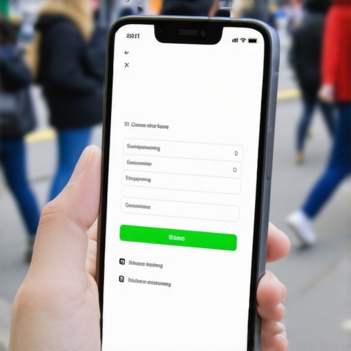
Imagine a local business, maybe one of those Warrenton bridal shops during sample sales where the energy is high and time is short. A bride is trying to send a quick inquiry while juggling a dress and a latte. If your form has twelve fields asking for her life story, she is going to drop the phone or close the tab. Local users are often on the move. They are dealing with spotty 4G signals on the outskirts of town or the flickering Wi-Fi of a train station. If your form requires a massive JavaScript library just to validate a phone number, it will hang. Data from the field shows that every additional field beyond four reduces conversion by 11 percent on mobile devices. It is better to have a lead with a name and a number than a ‘perfectly categorized’ lead that never clicked submit because the browser crashed halfway through. We see this lag frequently when the CSS fix that makes your site load faster on 4G is ignored. You want the engine to purr, not stall out at the first red light. [image_placeholder_1]
Why the standard advice is a blown head gasket
Every ‘expert’ out there tells you to use pop-up forms to catch attention. They are wrong. On a desktop, a pop-up is a minor annoyance. On mobile, it is a catastrophic engine failure. Most pop-ups are not sized correctly for the viewport, meaning the ‘X’ to close it is hidden off-screen or buried under a floating header. This is a primary reason stop using pop-ups that block the entire mobile screen is the first rule in my shop. Another mistake is using ‘Placeholders’ instead of ‘Labels.’ When a user starts typing, the placeholder disappears. If they get a text message and look away, they come back and forget what the field was for. Now they have to delete their text just to see the instruction. That is bad design. It is like putting a label on a fuse box that disappears as soon as you touch the fuse. Keep the labels visible. Keep the path clear. Stop trying to make the form look ‘sleek’ at the expense of it actually working. If the parts don’t move, the car doesn’t go.
The 2026 reality of intent-based forms
In the old days, we just threw a form on a page and hoped for the best. In 2026, the algorithm knows if your form is frustrating people. Search engines track the ‘Interaction to Next Paint’ (INP) and they know when a user is rage-clicking a submit button that isn’t responding. You need to implement real-time validation that doesn’t refresh the page. If there is an error, highlight the field immediately in red so the user can fix the leak. Don’t make them hit submit only to tell them they missed a digit in their zip code. Here are some common questions I hear in the shop:
Is it okay to ask for a physical address on a mobile form?
Only if you are shipping something immediately. Otherwise, it is just extra weight. Use a zip code lookup to save them the typing.
What is the best button color for mobile?
High contrast. If your site is blue, make the button orange. It needs to look like a handle you can actually grab.
Should I use CAPTCHA?
Standard CAPTCHAs are a nightmare for mobile. Use a ‘honey-pot’ field or background verification. Don’t make people identify fire hydrants on a two-inch screen.
Does my font size matter for forms?
Yes. If your input font is smaller than 16px, iOS will automatically zoom in when the user taps the field. This breaks the layout and confuses the user.
Should I use a single-column layout?
Always. Multi-column forms on mobile are a recipe for a wreck. Keep the eyes and the thumb moving in one straight line down the page.
Tightening the last bolt on your conversion rate
Fixing your mobile form isn’t about a fancy redesign. It is about clearing the grit out of the gears. You need to go through your site and test every input field while standing outside in the wind. If you can’t fill it out with one hand while distracted, it is not ready for the road. Start by auditing your header tags to make sure they aren’t pushing the form too far down the page, as we discussed in our guide on how to audit your header tags for mobile scannability. Then, look at your event tracking in GA4 to see exactly where people are dropping off. Are they quitting after the ‘Phone Number’ field? Then remove it. Your goal is a smooth idle and a fast start. If you want to keep your business running in 2026, you stop making your customers work for the privilege of paying you. Clean the workspace, calibrate the fields, and watch the leads start flowing again without the rattle. “