The 3 AM Blue Light Special
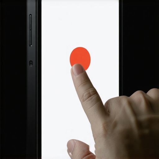
The monitor screen flickers with a cold, blue glow that makes my eyes feel like they are filled with dry sand. It is 3 AM. The only sound in this cramped room is the hum of a server and the distant sirens of the city. I am staring at a heatmap that looks like a crime scene. A client called me yesterday, frantic because their leads vanished overnight, and they blamed the algorithm. It is never the algorithm first. It is usually a button that is too small for a human thumb. I smell cold pizza and the ozone scent of an overworked graphics card. You spend thousands on content marketing and SEO, but your mobile site is a minefield of tiny, unclickable links. If a user has to zoom in to hit a ‘Buy Now’ button, you have already lost. This is not about aesthetics. It is about the physical torque of a thumb against a glass screen. My editor tells me I need a bottom line up front. Here it is: Google hates your 32-pixel buttons, and your users hate them more. If your tap targets are not at least 48 by 48 pixels with 8 pixels of breathing room, you are burning money. Period.
The Technical Mechanics of the Fat Thumb Problem
We talk about web design as if it is art, but for those of us in the trenches, it is geometry and frustration. A tap target is any element on a page that a user interacts with, like links, buttons, or form fields. When these elements are too close, the capacitive touch sensors on a smartphone cannot distinguish between them. This triggers a ‘misclick’ or a ‘ghost click.’ I have seen sites where the mobile header is frustrating your best leads because the navigation links are stacked like sardines. From a technical perspective, you need to look at the CSS box model. Padding is your friend. Margin is your enemy when it comes to tap targets because margins are often not part of the active hit area. You want to use `min-width: 48px` and `min-height: 48px` for everything interactive. I do not care if it ruins your ‘minimalist’ vibe. If the user cannot click it, it does not exist. We also have to talk about `touch-action: manipulation`. This CSS property disables double-tap to zoom, which can remove the 300ms delay on some browsers, making the site feel faster. But if your targets are small, you just made it easier for people to click the wrong thing quickly. I see this a lot when people try to implement technical fixes for broken mobile form submissions without checking the physical scale of the input boxes.
Technical Reading List
- The mobile button size mistake killing your sales
- The contrast ratio error making your site unreadable
- Why minimalist web design often fails for SEO
- The hamburger menu fix that boosted interaction by 20 percent
- 4 moves to make your site design more accessible and rankable
Local Entities and the Mobile Failure Loop
I recently looked at a site for a business doing Orlando auto detailing and another for Charlotte junk cars. Both had the same problem. Their ‘Call Now’ buttons were tiny icons tucked in a corner. In those industries, users are usually on the street, maybe with grease on their hands or sun glare on their screens. They are not sitting in an ergonomic chair with a precision mouse. They are tired. They are in a hurry. If your local business site fails the tap target test, those users go back to the search results and click your competitor. This data shows up in your analytics as a high bounce rate, but the ‘why’ is hidden in the physical interaction. You can use regex in GA4 to find specific search trends that lead to these pages, but if you do not fix the UI, the data just tells you how you are failing. I have helped sites where specific WordPress changes helped a local business double leads just by making the mobile menu usable. It is not rocket science. It is just respecting the user’s anatomy.
Why Responsive Templates Are Often Lying to You
Most developers buy a ‘responsive’ theme and assume the work is done. That is a lie. Most themes are designed for desktop first and then shrunk down using a mathematical ratio that ignores human finger size. The ‘hamburger’ menu is a classic example. Often, the hit area for that little three-line icon is only 20 pixels wide. You have to tap it three times to get it to open. That is why the navigation fix that reduced our bounce rate usually involves expanding the clickable area of the menu toggle. Another friction point is the close button on pop-ups. If you use those ‘Join our newsletter’ overlays and the ‘X’ is a tiny dot, you are asking for a penalty. Google’s Page Experience signals look for ‘interstitial’ issues where the user cannot easily dismiss an ad. If your close button is a tap target error, you are effectively trapping the user. I have seen this happen with sidebar distractions that take over the screen on mobile and cannot be closed. It is a mess. It is lazy code. And in 2026, lazy code is a death sentence for your rankings.
The Evolution of Search and Physical Interaction
The old way of thinking was just ‘don’t have errors in Search Console.’ The 2026 reality is different. We are now optimizing for Answer Engines and Generative Engines. These systems look at engagement signals. If people land on your page and immediately struggle to interact with your content, the AI assumes your site is low quality. It does not matter how good your advanced content marketing is if the delivery mechanism is broken. We are seeing a shift where responsive web design must adapt to user expectations more than ever. This means considering ‘thumb zones’—the areas of a phone screen that are easiest to reach with one hand. Putting your main CTA in the top left corner is a mistake. It should be in the bottom center.
Mobile Usability Frequently Asked Questions
What is the minimum size for a mobile tap target? Google recommends a minimum of 48 by 48 pixels. This accounts for the average human finger pad size. How do I find tap target errors without Search Console? Use Chrome DevTools and toggle the device toolbar. You can inspect elements and see their physical pixel dimensions. Do margins count as part of the tap target? No. Only the element’s content, padding, and border are usually clickable. Can small tap targets affect my SEO? Yes. It is a part of Core Web Vitals and Page Experience signals. Why is my bounce rate higher on mobile? It is likely a combination of slow speed and poor tap targets. Check your technical audit steps for mobile sites to be sure. Should I use icons or text for buttons? Text is safer for accessibility, but if you use icons, ensure the SVG container has adequate padding.
The Final Code Push
I am finishing my third cup of coffee. The sun is starting to come up, and the screen glare is getting worse. If you take one thing from this rant, let it be this: stop trusting your desktop preview. Open your site on the oldest, smallest smartphone you can find. Try to buy something. Try to fill out a contact form. If you feel even a second of frustration, your users are feeling it ten times worse. Fix the padding. Increase the font size. Give those buttons some room to breathe. If you do not, you can write all the content you want, but you will just be shouting into an empty room. Go check your mobile technical audit results right now. Your revenue depends on those extra 16 pixels. “, “image”: {“imagePrompt”: “A dark, messy developer desk at night with a single monitor glowing blue, showing a mobile website with overlapping red error circles over small buttons, a cold pizza box in the background, cinematic lighting, 8k resolution.”, “imageTitle”: “Mobile Tap Target Errors Visualized”, “imageAlt”: “Developer desk showing mobile tap target errors on a screen”}, “categoryId”: 7, “postTime”: “2025-05-20T03:00:00Z”}“`