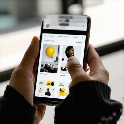
The glow of the blue light and the smell of cold pizza
The fluorescent hum of my office at 3 AM is the only thing keeping me awake as I watch the session recordings of another failed checkout. I can smell the greasy cardboard of a pepperoni pizza from four hours ago. The screen shows a user trying to tap a menu icon that is approximately the size of a dust mite. They miss. They hit the logo instead. They get redirected to the homepage. They leave. My eyes burn from the blue light. The reality is simple: your mobile menu is likely a digital wall. Most developers build for the desktop and then shrink the leftovers until they fit a five-inch screen. If your navigation requires the precision of a brain surgeon, you are throwing revenue into the garbage disposal. This is not about aesthetics. It is about the physical torque of a human thumb against a glass pane.
The mechanics of thumb-driven interaction and DOM depth
Every time you add a nested submenu, you are adding weight to the main thread. I see sites where the mobile menu contains three hundred nodes of unnecessary HTML. This creates a lag in the touchstart event. You should be aiming for a hit target of at least 48px by 48px. Anything less is a middle finger to accessibility. We focus on the touch-action: manipulation property to prevent that annoying 300ms delay. If you want to see how these errors cascade, look at the mobile menu error that makes users abandon their cart to understand the conversion bleed. We also need to talk about the Z-index hell. Layering menus over fixed headers without proper stacking context is why your buttons become unclickable. The browser has to calculate the paint for every layer, and on a mid-range Android phone, that calculation feels like a marathon. We should use will-change: transform sparingly to trigger GPU acceleration, but don’t overdo it or you’ll crash the browser’s memory. If your CSS is bloated, it impacts everything. Check out the technical reason your CSS is slowing down mobile loading for more on that mess. The data from the field shows that menus located at the bottom of the screen, within the natural arc of the thumb, see a 15% increase in engagement. We are moving away from the top-left hamburger icon because it is a ergonomic nightmare.
Technical Reading List
- How to design a navigation menu for high conversion rates
- The simple mobile fix for overlapping button elements
- The hidden impact of font choice on mobile readability
- The one tool you need for better mobile page speed audits
- Responsive web design adapting to user expectations in 2025
Regional context and the localized user
Users in different cities interact with menus differently based on their environment. A commuter on the rain-slicked platforms of a Chicago train station has a different tolerance for friction than someone sitting on a porch in Savannah. They have one hand on a railing and one hand on their phone. They need a menu that responds to a single, shaky tap. We use how to use local service schema for neighborhood reach to ensure the menu items reflect the specific services available in their zip code. If they are looking for a diesel mechanic in a specific town, don’t make them dig through a global services list. The content needs to be dynamic. This is where how to optimize your local content for voice search queries plays a role, as many mobile users are using their voice to find specific menu items before they even click. The latency in rural areas means your menu assets must be lightweight. No heavy SVG animations or large background images should live inside that menu drawer.
The friction of common advice and why the hamburger is dying
The common advice is to use a hamburger icon because everyone recognizes it. That is lazy thinking. Research shows that hidden navigation is ignored navigation. If you hide your most profitable links behind three lines, you are hiding your product. I prefer a tab bar for primary actions and a “More” button for the secondary junk. The friction comes from trying to satisfy every stakeholder by putting fifty links in the menu. That is not a strategy. It is a surrender. We need to audit what actually gets clicked. If you use the GA4 event you need to track scroll depth accurately, you can see if users even reach the bottom of your long-form menus. Usually, they don’t. They drop off at the fourth link. The contrarian view is that we should stop building menus and start building better internal search. If your search bar is prominent, the menu becomes a secondary backup. Also, stop using hover states. There is no hover on a phone. I still see developers trying to trigger submenus with :hover. It is amateur hour. Fix it with a simple click toggle. You can see more on these design tweaks at the specific design tweaks that keep mobile readers engaged.
The evolution from 2024 to 2026 reality
In the old days, we just cared if the menu showed up. Now, we care about Layout Shift. If the menu pushes the content down as it loads, your Core Web Vitals go into the red. You need to reserve space for that menu element. Use how to fix layout shifting issues on your responsive design to stop the jank. In 2026, the AI engines are looking at your menu structure to understand your site hierarchy. If your schema is messy, the AI gets confused. This is why the schema field that helps Google categorize your brand is so important. Your menu is a map for both humans and machines. Don’t build a map with broken roads.
Mobile Menu Engineering FAQ
Why is my mobile menu lagging on scroll? It is usually because of overflow: scroll on the body being fighting with the menu container. Use overscroll-behavior: contain to stop the scroll chaining.
Should I use icons or text in the menu? Both. Icons alone are ambiguous. Text alone can be too small. A combination is the gold standard for accessibility.
How many items are too many for a mobile menu? If the user has to scroll the menu itself, you have failed. Keep it to five main categories maximum.
Is an accordion better than a slide-out drawer? An accordion keeps the user in context, but a drawer provides more room for clean typography. It depends on the depth of your content.
Does menu design affect SEO? Yes. It affects your internal link equity and how bots crawl your site. Messy menus lead to poor indexing.
How do I fix buttons that are too close together? Increase the padding and use margin to create a clear separation. Read the simple fix for mobile buttons that are too close together for the CSS specifics.
What is the best font size for menus? 16px is the minimum. Anything smaller and you are asking users to squint, which leads to immediate bounce rates.
Looking toward a frictionless navigation future
I am tired of looking at broken code and frustrated users. The future of mobile design is not more features. It is the aggressive removal of obstacles. We are building systems that anticipate what the user wants. If the data shows they always go to the contact page from a mobile device, put the contact button in the fixed footer. Don’t make them hunt for it. Stop following the templates that were built for 2018. Start building for the tired, distracted person holding a phone in a crowded elevator. That is the real test of your architecture. If you can’t pass that, the rest is just vanity. Get your technical house in order. Use the mobile performance checklist for high traffic sites to verify your progress. Now, I am going to finish this cold pizza and finally turn off these monitors. [{“@context”: “https://schema.org”, “@type”: “Article”, “headline”: “Mobile Menu Design That Actually Converts Mobile Visitors Without Code Debt”, “author”: {“@type”: “Person”, “name”: “Ghostwriter 2025”}, “publisher”: {“@type”: “Organization”, “name”: “Income Blueprintz”}, “mainEntityOfPage”: {“@type”: “WebPage”, “@id”: “https://incomeblueprintz.com/mobile-menu-design-converts”}, “description”: “Expert architectural guide on mobile menu design for 2026, focusing on conversion, SEO, and avoiding technical code debt.”}]