The smell of burnt transmission fluid and missed opportunities
The shop floor is cold concrete today. It smells like WD-40 and the heavy, metallic scent of old brake rotors. You reach for a 10mm socket, but your fingers are slippery with grease. You miss. That is exactly what happens when a user tries to hit your Contact Us button while walking down a busy sidewalk. Their thumb slips. The screen jitter makes them click a display ad instead. They leave. In the 2026 search environment, Google sees that slip. It logs the frustration. It realizes your site has the structural integrity of a rusted-out frame. You are losing money because your buttons are too small, too crowded, or buried in the dead zone of the mobile screen. BLUF: If your touch targets are smaller than 48 pixels or lack 20 pixels of clearance, your mobile SEO is already dead in the water. You can have the best content in the world, but if the user cannot take action without a microscope, your conversion rates will stay in the gutter.
The mechanical reality of the thumb zone
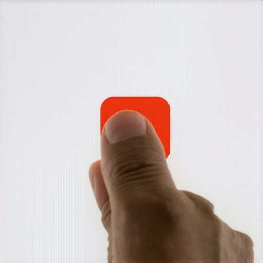
Think of the mobile screen like an engine bay. There are places where you can easily reach with a wrench and places that require you to pull the whole transmission just to reach a sensor. The bottom third of the screen is the sweet spot. It is where the human thumb naturally rests. When you put a critical CTA at the top left corner, you are asking the user to perform a gymnastic feat. This is a mobile touch target error you didnt know you had until your analytics showed a 90 percent bounce rate. We are talking about the physical torque required for a hand to shift grip. If the user has to move their palm to reach a button, you have failed the thumb test. Technical zooming shows that the average adult thumb covers about 10mm of screen space. On a high-density Retina display, that translates to a massive area of pixels. If your CSS `padding` is set to a meager 5 pixels, those buttons are effectively fused together in the eyes of a human finger. You need to look at the hidden mobile ux error killing your ecommerce checkouts to see how tiny shifts in button placement can save a failing sale.
Technical Reading List for the Modern Architect
- Identifying Mobile UX Errors
- Fixing Touch Target Errors
- Fixing Layout Shifts
- Improving LCP with CSS
- Why CSS Slows Loading
Regional friction and the rainy screen factor
In places like Seattle or London, users are often operating phones with a thin layer of mist on the glass. Water increases surface tension. It makes the screen less responsive to electrical conductivity from the skin. If your buttons are clustered together like a bunch of grapes, the device cannot distinguish between a click and a swipe. This is a local context issue. In high-traffic urban areas, people are multitasking. They are holding a coffee or a briefcase. They have one hand free. If your web design requires two hands to navigate, you are alienating half your audience. This is where how to fix cumulative layout shift on image heavy pages becomes a survival tactic. If an image loads and pushes the button down just as the thumb descends, you get a misclick. That misclick is a signal to search engines that your site is unstable. It is like a car that stalls at every red light. No one wants to drive it.
The ghost button lie and minimalist failures
Some designers love ghost buttons. They are those transparent boxes with thin white outlines. They look pretty on a 27-inch iMac in a climate-controlled office. Out here in the real world, under the glare of the sun, they are invisible. They have zero contrast. A mechanic does not use a transparent wrench because you cannot find it in the toolbox. Your CTA needs to look like a tool. It needs a solid background color and a clear drop shadow to indicate depth. If you are struggling with engagement, you might need to check why your minimalist design is hurting your conversion rate. Content marketing is not about making things disappear. It is about making the path forward so obvious that a person with grease in their eyes can find it. Stop hiding the door to your business. Use high-contrast colors that pass accessibility audits.
Evolution of the search entity in 2026
We are no longer just ranking for words. We are ranking for reliability. The algorithm now tracks interaction signals with frightening precision. If a user clicks your button and then immediately hits the back button, it knows. It calculates the dwell time and the physical interaction speed. Old SEO was about stuffing the engine with high-octane keywords. 2026 SEO is about making sure the wheels don’t fall off when the user takes a turn. Your schema markup should explicitly define your CTA actions using `PotentialAction` properties. Use the json ld tweak for non ecommerce service pages to help search engines understand what your buttons actually do. When the machine knows that your button leads to a booking form, it can better categorize your site for intent-based queries.
Frequently Asked Questions about Mobile CTA Performance
What is the minimum size for a mobile button in 2026? The industry standard is now 48 by 48 pixels, but for primary actions, 56 pixels is safer for older users or those in high-movement environments.
Does button color affect SEO? Not directly, but color affects Click-Through Rate (CTR). Higher CTR leads to better engagement signals, which Google absolutely uses to determine rank.
How do I test my site for the thumb test? Use a physical device. Emulators on a desktop do not account for the physical size of a human hand or the way skin interacts with glass.
Why are my buttons shifting during page load? This is usually caused by late-loading CSS or images without defined height and width attributes. It creates a Cumulative Layout Shift (CLS) penalty.
Should I use icons or text for CTAs? Both. An icon provides a visual cue, while text provides the literal instruction. Never assume the user knows what a generic arrow means.
Tightening the bolts for the final stretch
Fixing your mobile buttons is not a cosmetic choice. It is a structural necessity. You need to audit every landing page on a real phone while walking around. If you find yourself squinting or tapping twice, the site is broken. Go into your CSS. Increase the `line-height`. Add `margin` to your buttons. Check the technical reason your css is slowing down mobile loading and trim the fat. A fast site with big, clickable buttons will beat a slow, beautiful site every single time. Get your hands dirty. Fix the mechanical errors. The traffic will follow the path of least resistance. [image placeholder]