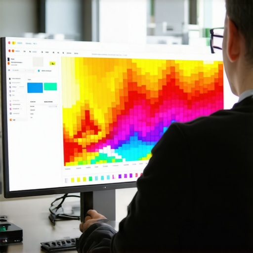
The smell of linseed oil is heavy today, clinging to the rafters of my workshop like a thick varnish. I am currently stripping back three layers of cheap, lead-based paint from a 1920s oak sideboard. It is honest work. You see the grain eventually. You find where the wood has expanded, where the joints have weakened, and where previous owners tried to hide rot with a quick lick of gloss. Digital design is no different. Most people build websites like they are assembling flat-pack furniture: fast, flimsy, and prone to wobbling. They ignore the structural integrity. When a user lands on a page, they are looking for a solid surface. If they find friction, they leave. Heatmaps are the infrared goggles that let me see exactly where the finish is wearing thin. Editor’s Take: Heatmaps provide the visual evidence of user frustration, allowing architects to identify high-friction zones and optimize conversion paths by observing actual behavioral data rather than relying on theoretical best practices. If you want to fix your site, you have to stop guessing where the splinters are and start looking at the thermal signatures of every click and hover.
The rasp of the user cursor
In the digital shop, friction is not a physical resistance but a cognitive one. It is the micro-second of hesitation when a button looks like a label or when a navigation menu hides behind a cryptic icon. Heatmaps come in three distinct flavors: click maps, move maps, and scroll maps. Click maps are the most blunt. They show you where people are hitting the surface. If I see a cluster of clicks on a non-linked image of a dovetail joint, I know the user expects that image to lead somewhere. It is a broken promise. Move maps are more subtle, tracking the path of the cursor as it wanders like a hand over a sanded board. Research indicates that cursor movement correlates strongly with eye tracking. When a cursor hovers over a specific paragraph for ten seconds without clicking, that is a sign of interest or, more often, confusion. You can see how updated web design standards improve user experience by aligning these visual cues with modern expectations. Scroll maps tell the story of depth. If 80 percent of your visitors stop scrolling before they reach your price list, your page is too long or your introduction is too dull. It is like a chair with legs that are three different lengths: it simply will not hold weight. We often see that the one design move that lowers your bounce rate overnight is simply moving your most vital information to where the heatmap is hottest.
Technical Reading List
- The navigation error hiding your most important pages
- 7 UX secrets for high converting landing pages
- The hidden CSS error slowing down your mobile site
- 3 mobile header fixes that improve navigation flow
- How to optimize your footer for search without looking like spam
The humidity of Asheville and the digital load
I work out of a small studio near the French Broad River in Asheville. The humidity here is a constant adversary. It makes the wood swell, and if you do not account for that in your joinery, the whole piece will eventually crack. Websites have their own climate: the mobile environment. Data from the field shows that mobile users have a much higher friction threshold than desktop users. Their thumbs are clumsy. Their screens are small. If your buttons are too close together, you get fat-finger errors, which show up on heatmaps as a messy splatter of clicks rather than a focused bullseye. In Asheville, we value things that are built to last through the seasons. A mobile-responsive site must be built with the same foresight. If your layout shifts as the page loads, you are creating a digital earthquake. You can find the technical fix for mobile layout shifting issues to ensure your joints stay tight. Friction often hides in the shadows of slow loading times. A heatmap might show no activity at all on a beautiful call-to-action button simply because the user became impatient and left before the element even rendered. This is why specific image tweaks to fix slow mobile loading speeds are more than just optimization: they are the foundation of user trust.
The lie of the clean aesthetic
Many modern designers are obsessed with minimalism. They want everything to be white, airy, and void of detail. In my world, that is like building a table without a rim: things are going to slide off. This aesthetic often creates massive friction points. When you remove the visual borders from a form field, you make the user work harder to find where to type. Heatmaps reveal this immediately. You will see cursors circling the area like a moth around a porch light, unable to find the entry point. The contrarian truth is that sometimes more is better. A clear, high-contrast button might look clunky to a minimalist, but the heatmap will show it as a beacon of clarity. I have seen sites where UI changes that make your site feel more professional actually involve adding more structure, not taking it away. Another common mistake is the use of stock imagery that lacks soul. Users have a built-in detector for the generic. If a heatmap shows that people are ignoring your hero image entirely, it is because stock photos are killing your brand trust. They are a veneer that has peeled away, revealing the particle board underneath.
Predictive thermal imaging in 2026
The old guard used to wait months to gather enough data for a heatmap. They would let a thousand users fail before they decided to move a button. In 2026, we use predictive AI heatmaps that analyze the visual hierarchy of a page before it even goes live. These tools simulate ocular movement based on millions of historical data points. It is like knowing exactly how a piece of cherry wood will age before you even apply the first coat of wax. This allows us to pre-emptively fix friction points. However, the machine lacks the human touch. It can tell you where a user will look, but it cannot tell you why they feel hesitant. That requires a deeper look at search intent. If your page does not match what the user was looking for, no amount of heatmap optimization will save you. You must understand how to map search intent to your customer journey to ensure the content itself is not the source of the friction. How do I fix a heatmap showing no clicks on my main button? Check your contrast ratios first, then ensure no hidden CSS elements are overlapping the button, preventing the click from registering. Can heatmaps help with SEO? Indirectly, yes. By reducing friction and increasing dwell time, you signal to search engines that your page is a high-quality destination. Do heatmaps slow down my site? Modern scripts are asynchronous and lightweight, but you should always monitor your core web vitals. What is a rage click? It is when a user clicks an element multiple times in rapid succession, usually because it is unresponsive or slow. Are move maps accurate for mobile? No, mobile heatmaps primarily focus on taps and scrolls, as there is no cursor to track movement without contact.
The final polish
Building a website that converts is not about following a trend. It is about the joinery. It is about ensuring that every piece of the interface fits together without gaps, splinters, or rough edges. When you use heatmaps to find design friction points, you are performing the digital equivalent of running your hand over a finished tabletop. You feel the imperfections. You take your sandpaper and you work until the surface is smooth. Do not be afraid to strip back the paint. If your data shows that users are struggling, have the courage to redesign. A well-built site, like a well-built cabinet, should last for years and only get better with age. It is time to stop hiding the flaws and start fixing the structure. If you are ready to see the truth, start by analyzing your current layout. You might find that a single design change is all that stands between a bounce and a lifelong customer. Keep the tools sharp and the grain clear. “