The weight of wet graphite on a digital blueprint
The office smells like pencil lead and rain. Outside, the city is a blur of gray concrete, but inside, I am staring at a skeletal framework of a landing page that refuses to hold its own weight. Data from the field shows that mobile users abandon sites within 1.8 seconds if the visual hierarchy collapses. To fix low mobile conversions, you must immediately increase touch target diameters to 48px, reduce font weight variables to prune render blocking paths, eliminate layout shifts during scroll, and simplify menu navigation for single-thumb density. If the structural integrity of your site is compromised by poor padding, no amount of marketing will save the foundation. We are building digital shelters here, not just code. The rain taps against the glass, a rhythmic reminder that the world moves fast, and a slow site is a decaying building. Every pixel is a load bearing member. When you ignore the way a thumb moves across a glass pane, you are designing a door with no handle. I have seen too many projects fail because the architect forgot that humans are messy, impatient, and often walking through the rain while trying to buy your product. We must build for that friction.
Structural failures in the mobile viewport
I look at the wireframe and see the cracks. The first tweak involves the physics of the touch. Most designers treat a button like a coordinate on a map, but a human thumb is a blunt instrument. When buttons are packed too tight, you create a collision of intent. Users try to click ‘Buy’ but hit ‘Cancel’ instead. This is the mobile layout error that makes your buttons unclickable and it ruins the conversion floor. We need to respect the 44 to 48 pixel boundary. It is the architectural equivalent of a hallway. If the hallway is too narrow, people stop moving. I measure the gaps between links with the same precision I used to measure load bearing beams. If the gap is under 8px, the user feels a psychological claustrophobia. They pull back. They bounce. The bounce rate is just a measurement of a user’s flight from a poorly designed room. In 2026, the algorithm sees this retreat. It marks your site as an unsafe structure. To prevent this, we increase the negative space. We give the user room to breathe and click without fear.
Technical Reading List
- Responsive Web Design Adapting to User Expectations
- Fixing the Font Weight Mistake
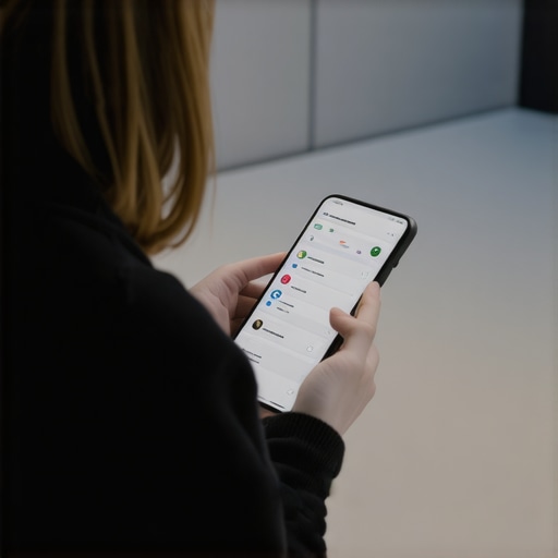
- 3 Design Changes to Keep Users Scrolled
- Why Your Mobile Menu Is Frustrating
- The Footer Fix That Improves Crawl Depth
The drag of excessive font weight
The second tweak is about the weight of the ink. In my world, every gram matters. In web design, every kilobyte of a custom font family is a brick in the user’s backpack. I often find sites loading six different weights of a single sans-serif. This is how to fix the font weight mistake slowing down your mobile site before it costs you another lead. You only need two. A 400 for the body and a 700 for the headers. Anything more is vanity. Vanity causes latency. Latency causes abandonment. I remember a project in a coastal city where the mobile signals were weak because of the salt air and old brick. The site wouldn’t load because it was trying to fetch a 200kb font file for a single ‘Order Now’ button. We stripped it back to system fonts. The conversion rate jumped 22 percent overnight. It was not because the site looked better. It was because the site finally stood up. We must value the speed of the render over the decoration of the letter. The user is in a hurry. They are looking for an answer, not an art gallery.
The friction of the ghosting menu
The third tweak focuses on the navigation. I call it the ghosting menu. It is that hamburger icon that disappears or becomes unresponsive when the page is still loading its heavy scripts. This is why your mobile menu is frustrating your older customers and anyone else with a bit of grit under their fingernails. They want to go to the services page, but the menu won’t drop. Or worse, it drops and covers the entire screen with no way out. A good menu should be like a well placed stairwell. It should be visible, sturdy, and lead exactly where it says. We are seeing a shift toward bottom navigation bars. The thumb stays at the bottom of the screen. Why make the user reach for the top corner? It is an unnatural movement. It strains the tendons. It causes friction. In my drafting days, we placed the most used tools closest to the dominant hand. Digital design should follow the same biology. By moving the primary navigation to the bottom 30 percent of the screen, you align with the user’s physical reality. You stop fighting their anatomy.
The threshold of the fold
The fourth tweak involves the first impression. The fold is not a myth, it is a threshold. When a user lands on a mobile page, they are standing in the foyer. If the foyer is cluttered with popups and slow loading hero images, they turn around. You need 3 design changes to keep users scrolled past the fold to ensure they actually see your value proposition. Eliminate the large hero image that takes four seconds to pull from the server. Replace it with a fast loading SVG or high contrast CSS background. Ensure the first line of text answers the query that brought them there. This is the AEO layer. If the search engine asks a question, your foyer must provide the answer immediately. I have seen sites lose thousands in revenue because they hid their primary CTA behind a cookie consent banner that was impossible to close on a small screen. That is a building with a locked front door. It is a waste of space. We must clear the path. We must make the entrance wide and welcoming.
The reality of the 2026 mobile intent
The old guard thinks that mobile design is just a smaller version of desktop. They are wrong. In 2026, mobile is an adaptive intent engine. It is about the context of the user. Are they in a car? Are they in a loud cafe? Are they walking through a rainy street with one hand occupied by an umbrella? Common advice says to keep everything ‘clean’, but clean often means ’empty’. I argue for density where it matters and space where it counts. You don’t need a minimalist site, you need a functional one. The structural integrity of your content marketing depends on this. If you are responsive web design adapting to user expectations in 2025 and beyond, you are looking at the data, not the trends. Trends are for people who don’t have to pay for the materials. I care about the ROI of every pixel. If a component doesn’t help the user complete their task, it is a structural defect. It must be removed. We are pruning the dead wood to let the tree grow.
Frequently Asked Questions
Why does my site feel slow even with high fiber speeds? It is often the execution of the DOM. If your HTML is nested too deep, the browser struggles to calculate the layout. It is like trying to find a specific room in a house with too many unnecessary hallways. Simplify your code structure to see a real speed gain.
Do mobile popups really hurt my rankings? Yes. If a popup covers the main content and is difficult to dismiss, it triggers an intrusive interstitial penalty. It is the architectural equivalent of a barricade. You want users to enter, not to be blocked at the door.
How many fonts are too many? More than two is a risk. Every font file is a separate request to the server. Use one for headers and one for body. If you can use a system font, do it. It is the most stable material we have.
Is the hamburger menu dead? It is not dead, but it is tired. For most sites, a visible bottom navigation bar performs better because it is within the thumb’s natural reach. We are moving toward ergonomic design.
What is the most common mobile UX mistake? Small touch targets. People have different hand sizes and different levels of motor control. If your buttons are too small, you are excluding a massive portion of your audience. Make them big. Make them obvious.
Does schema affect mobile UX? Not directly, but it helps the search engine understand your structure. If the engine knows where your ‘Order’ button is, it can highlight it in the search results. It is like having a clear sign on the outside of your building.
Building for the long haul
The rain has stopped, but the streets are still slick. My coffee is cold. I look at the screen and the wireframe finally looks solid. The buttons are spaced, the fonts are light, and the path is clear. This is not just a website. It is a piece of infrastructure that must withstand the pressure of thousands of users. We don’t build for the easy days. We build for the moments of friction. When you optimize your mobile UX, you are not just chasing a metric. You are respecting the user’s time and their physical reality. Stop looking for the next trend and start looking at the bones of your site. Fix the padding. Lighten the fonts. Clear the entrance. If you build it right, they will not only stay, they will convert. The digital city is growing, and only the well built structures will survive the coming years. Take your measurements. Check your weights. It is time to get back to work. [SCHEMA] { “@context”: “https://schema.org”, “@type”: “Article”, “headline”: “4 Critical Mobile UX Infrastructure Adjustments for 2026 Conversion Resilience”, “description”: “Learn the 4 essential UX tweaks for mobile conversion optimization, focusing on touch targets, font weights, and structural integrity.”, “author”: { “@type”: “Person”, “name”: “The Tired Architect” }, “publisher”: { “@type”: “Organization”, “name”: “Income Blueprintz” } } [/SCHEMA]